The Love stamp has outlived trends. It has also quietly taught millions how a tiny rectangle can carry a big idea.
## How Love Stamp Symbolism Evolved
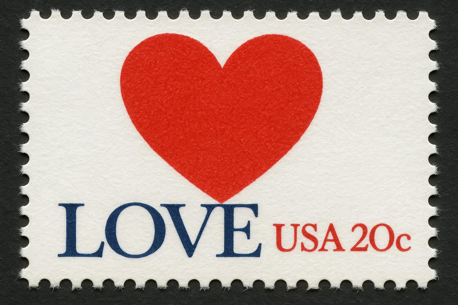
The first widely recognized USPS Love stamp, released in 1973, borrowed a pop-art wordmark that was already everywhere: Robert Indiana’s stacked LOVE design, with the tilted O. On a scale meant for a letter, that bold arrangement felt almost defiantly intimate. People stuck the stamp on valentines, wedding envelopes, care packages. They also stuck it on things it was never intended for, which is where the real story of love stamp symbolism begins.
Designers kept returning to the theme because the message is flexible. The original conveyed affection in a blunt, graphic way, but later iterations softened up, added hearts, flowers, even script. Each new issue nudged the public’s understanding of what a stamp says when you can’t speak it aloud.
### The Original Design And Why It Stuck
The stacked letters are simple: L-O on top of V-E, with the O slanted. That tilt gives it motion; it feels less like a label and more like a gesture. The red and blue prints used by the USPS echoed national colors, which made the design feel both personal and civic. The pop-art origin also tied the stamp to a broader visual movement that many Americans recognized.
There’s a practical reason it endured. A stamp has to be legible at twenty millimeters. That constraint pushes designers toward high-contrast shapes and few elements. The LOVE wordmark met that brief perfectly and passed an emotional test at the same time.
### Love Stamp Meaning Beyond Romance
Most people think “love stamp meaning” means romance, and that’s often true. But it’s not the whole story. For some senders the stamp signals thanks—after a funeral, a get-well card, or a long friendship. For others it’s a subtle political act: choosing a heart-themed stamp for a message about community care or to support a cause. The stamp becomes shorthand.
Philatelists see more nuance. Varieties, color shifts, printing errors—these things turn a common symbol into a collectible object. When you choose a specific love stamp for a wedding invitation, you’re making a tiny curation that says as much about taste as it does about feeling.
## Reading The Visual Cues
If you look closely, the elements on a love stamp read like a sentence. Color is the subject, shape is the verb, typography supplies tone. That’s stamp symbolism in practice: designers use minimal marks to trigger a rich array of associations.
### Color, Type, And Tiny Details
Red still functions as shorthand for passion and urgency. Pink softens the message, making it platonic or nostalgic. Blues and greens can turn the idea toward calm support or environmental love. Type choices—block letters, script, serif—also modulate meaning. A cursive script suggests intimacy and tradition; bold sans serif suggests declaration and modernity.
Small details matter. Perforations frame the image and remind us the stamp was made to circulate. Cancellation marks are more than functional—they record a journey. A pristine mint stamp looks like an icon. A postmarked one looks like evidence: someone sent this.
#### The Tilted O And Its Subtle Pull
That tiny tilt in Indiana’s O is a case study. It prevents the word from feeling static. The tilt implies a human misalignment, an imperfection that makes the message feel lived-in. It’s a detail that many viewers might not be able to name, but they feel it.
## Stamp Symbolism In Cultural Moments
Stamps are public artifacts. They appear on mail that moves across networks, which means they show up in collective rituals: weddings, funerals, protests, holiday mailings. Over decades, a single design can accrue layers of meaning the artist never intended.
During wartime or national crisis, a love-themed stamp can feel like a small, private resistance: a reminder to care. In times of celebration, the same stamp reads as headline-maker; people notice the way the design complements the moment.
### Flagging Trends And Collector Behavior
Collectors study print runs, plate numbers, paper types. These technical details are how stamp symbolism becomes monetized. A rare color variation or a misprinted sheet changes a sentimental object into an investment. That shift influences demand, and demand influences what designers and the USPS decide to produce next.
Public campaigns also shape perception. The USPS has issued love stamps tied to holidays and special events. Those releases teach the public which visual cues correspond to which occasions. Over time, the public learns a shorthand: certain hearts = weddings, certain florals = sympathy.
### Everyday Uses That Stick
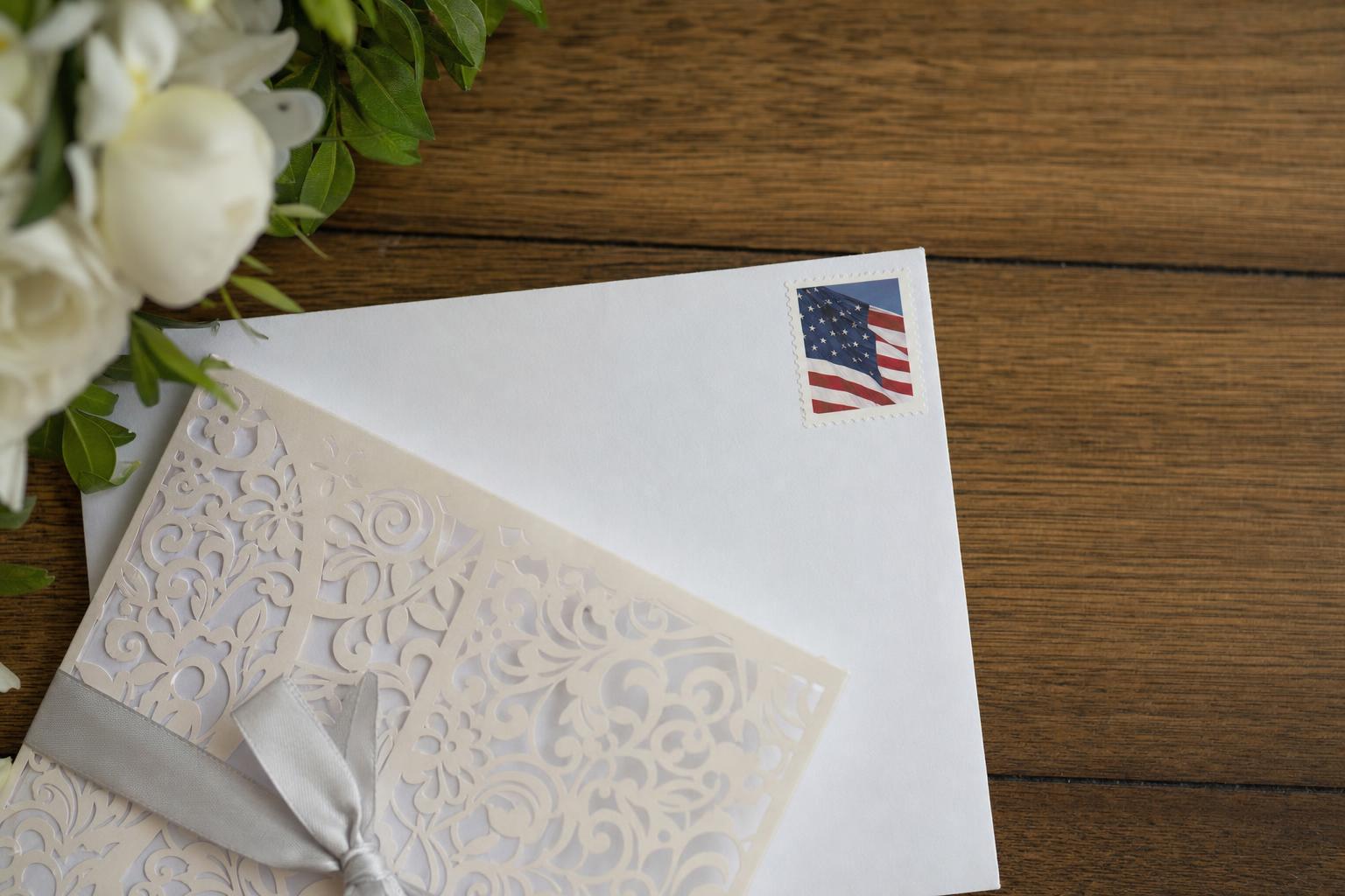
You don’t need to be a collector to use a love stamp thoughtfully. Wedding invitations with a matching stamp, a first-day cover slipped into a letter, a small sheet used as table confetti—these are grassroots ways people repurpose stamp symbolism. Even when the sender’s words are sparse, the chosen stamp fills in emotional context.
Some people assemble envelopes as keepsakes, with stamps and cancellation marks forming a small archival object. Others stick a love stamp on a bill or a bureaucratic notice to make someone smile. It’s a tiny intervention in daily life. It works because the symbol is compact and legible.
## Design Lessons From A Small Canvas
Designers working on love stamps learn to be economical. You have to convey complex emotion with minimal ink. That constraint forces decisions about scale, contrast, and redundancy. Good stamp design clarifies rather than decorates.
Experimentation continues. Recent issues have mixed photography with illustration, or used metallic inks to catch the eye. Those variations expand the palette of love stamp meaning, but they don’t erase what came before. People still reach for the classic stacked LOVE when they want an unmistakable signal.
### Why The Symbol Still Resonates
A stamp travels. It moves through hands and machines and crosses thresholds from private to public and back again. That pathway is part of its power. The symbol on that tiny piece of paper meets the social act of sending. The meaning comes not only from the image, but from the ritual around it—addressing, sealing, dropping into a box, waiting.
The next time you choose a stamp, think about what you want the paper to say. A love-themed choice will likely do more than decorate the envelope. It will prime the recipient to recieve a message in a particular light. That’s the practical magic of stamp symbolism.
Leave a Reply