## How USPS Stamp Designers Turn Small Canvases Into Big Stories
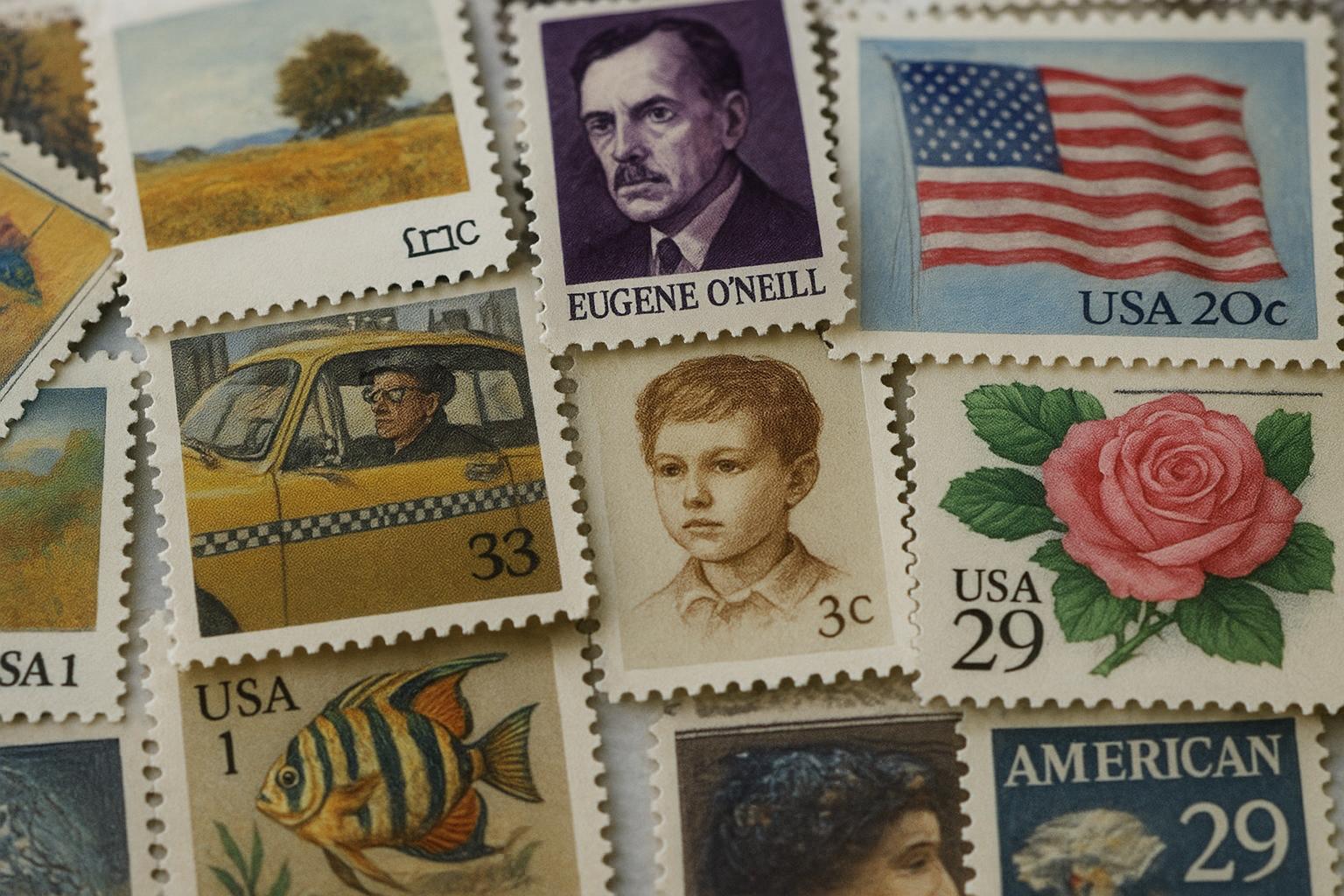
When you look closely at a postage stamp, you’re seeing a tiny piece of public history. That compression of narrative—an event, a person, a place—onto a two-centimeter square doesn’t happen by accident. The usps stamp designers treat each issue like a small museum exhibit that needs a clear idea and unambiguous craft.
They work in teams: an art director, an illustrator, a typographer, sometimes a photographer. The collaboration is tight because there’s no room for negotiation once the sheet goes to press. You can see the result in stamps that keep surprising people—like a postal issue that used layered translucency to make a landscape appear to change with the angle of light. The trick is not a gimmick but careful composition and material choices.
### The Brief: How Ideas Survive The Tiny Frame
Design briefs for stamps are short and specific. A committee proposes subjects, and from those choices the creative team refines a concept. The brief will specify subject, tone, and factual elements that must appear—for example, the correct dates, a portrait likeness, or specific landmarks.
A good stamp design starts with a strong silhouette. At postage scale, fine detail blurs. Good design prioritizes contrast, memorable shapes, and a focal point. The usps stamp designers often test thumbnails at life-size and then shrink them until the visual still reads. This iterative shrinking is where many ideas fail and a few survive.
### The Materials And Techniques That Make Stamps Sing
There’s more than drawing here. Some modern issues use varnishes, embossing, or different paper stocks to create texture. Photographic imagery is sometimes combined with hand-drawn elements. In one recent series, a designer scanned a linocut print and layered color separations to get the tactile feel of relief printing while keeping photographic clarity.
Type matters too. Letterforms on stamps must be legible at very small sizes, but they also carry tone. A serif can feel formal, a condensed sans can look modern. The typography choices by stamp designers are often the reason a historical subject reads as dignified rather than quaint.
#### Balancing Accuracy And Emotion
Accuracy is non-negotiable for subjects like historical figures or official events, but accuracy alone makes a piece dry. The challenge is to inject warmth or urgency without changing facts. For a civil-rights commemorative, designers used close-cropped portraits with warm midtones to create empathy, while keeping dates and attribution clearly set in a small, readable font.
## Why Some Stamps Become Iconic
A stamp becomes iconic when it does more than represent; it translates. Think of how a single image can reframe public memory. The usps stamp designers aim for that translation. They pick an angle that reveals something new: a rarely-seen photograph, a candid expression, or a compositional twist that changes how you see a well-known subject.
Sometimes it’s luck. A subject enters the cultural conversation at the right time; people attach personal meaning. Other times it’s craft—an inventive use of negative space or an unusual cropping that lingers in the eye.
### The Role Of Public Input And Critique
The Postal Service solicits public feedback on many issues. That feedback can be surprising; collectors point out historical errors, cultural groups advocate for different imagery, and casual viewers push back on tone. Stamp designers must be willing to revise work in response to critique while protecting the visual integrity of the design.
This is not a straight line. A page of feedback might reveal a simple factual error that gets corrected, or it may force a rethinking of the whole composition. Designers learn to sift comments quickly to find what is essential and what is preferential.
### Behind The Scenes: A Day With The Design Team
A typical day inside a studio working on stamps moves fast. Mornings are for research and sketching. Afternoons go to mockups and conversations with historians or subject-matter experts. By late day someone is comparing proofs under different lights.
One lead designer described how they built a mock display of thumbnails on the wall. The team stood back and pointed at what read from ten feet away. If the image failed that distance, it failed on the mailbox. The goal is immediate readability and emotional clarity, not ornate decoration.
## How Technology Has Changed Stamp Design
Digital tools have opened possibilities that were previously impractical. Vector illustration lets designers adjust line weight and scale without losing clarity. Color separations can be tested on screen with surprising accuracy. But technology hasn’t replaced craft; it amplifies it.
A designer recently combined 3D scanning with hand-painted textures to create a stamp that seemed to pop off the paper. The technical process required several stages: scanning, retouching, color correction, then old-fashioned proofs. The end result felt tactile even though it began in a digital space.
#### The Ongoing Challenge Of Reproducibility
Stamps are printed in huge runs. A design that looks great on a high-res monitor must survive printing at scale. Color shifts, registration issues, and paper stock inconsistencies can all alter the final look. That’s why prototypes and press checks are essential. The team checks final sheets, not just mockups, and sometimes makes last-minute tweaks to ink densities or varnish coverage.
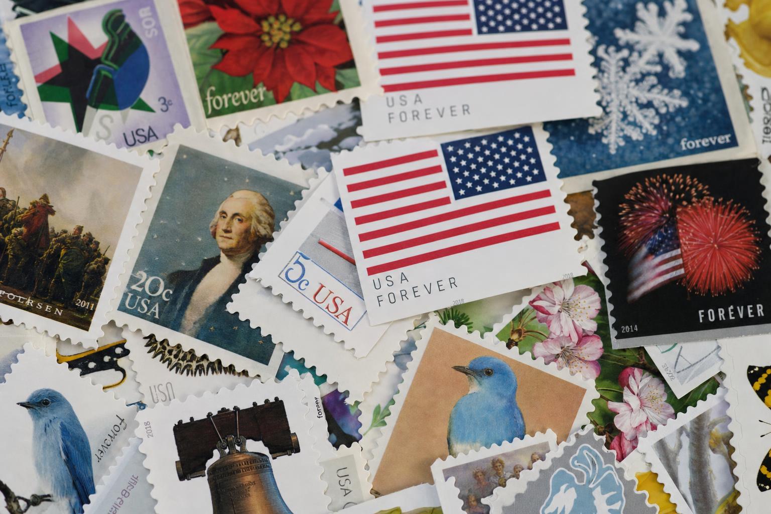
## Stories Hidden In Plain Sight
Many stamps contain small, intentional details that reward attentive viewers. An astronomer’s portrait might include a faint star field that doubles as a map. A folk-music issue might hide instrument details in the background texture. These flourishes are not mere decoration; they are narrative anchors.
The usps stamp designers love those little secrets. They know collectors and casual mailers alike will notice something new after a second look, and that makes the object worth keeping. Sometimes the detail is cultural—an embroidered pattern sampled from a community cloth. Sometimes it’s technical, like a micro-engraving that becomes visible only when you tilt the paper.
### Collaborations With Living Artists And Communities
There has been a trend toward commissioning living artists and working directly with communities. These collaborations bring new perspectives and prevent cultural flattening. When a stamp is about a local tradition, designers often travel to the community, sketch on-site, and include cultural advisors in the process.
One collaboration involved textile patterns from a diaspora community. The designers photographed cloth, sampled motifs, and then translated those forms into graphic elements that read at postage size. The result felt authentic rather than appropriative because the community saw and signed off on the design.
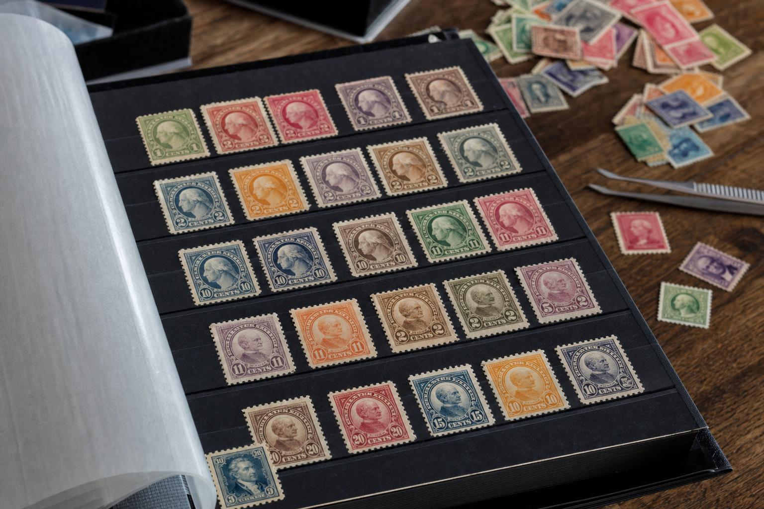
## Collecting As A Way To Preserve Design Work
Stamp collecting isn’t only about accumulation; it’s a practice of noticing. Collectors trace changes in technique and taste across decades. Through those collections, the work of usps stamp designers remains visible and studied.
Museums sometimes acquire sheets as artifacts, showing how a stamp reflects the social mood of its time—a wartime issue with bold patriotic colors versus a later commemorative that favors subtlety. These contrasts map larger shifts in visual culture.
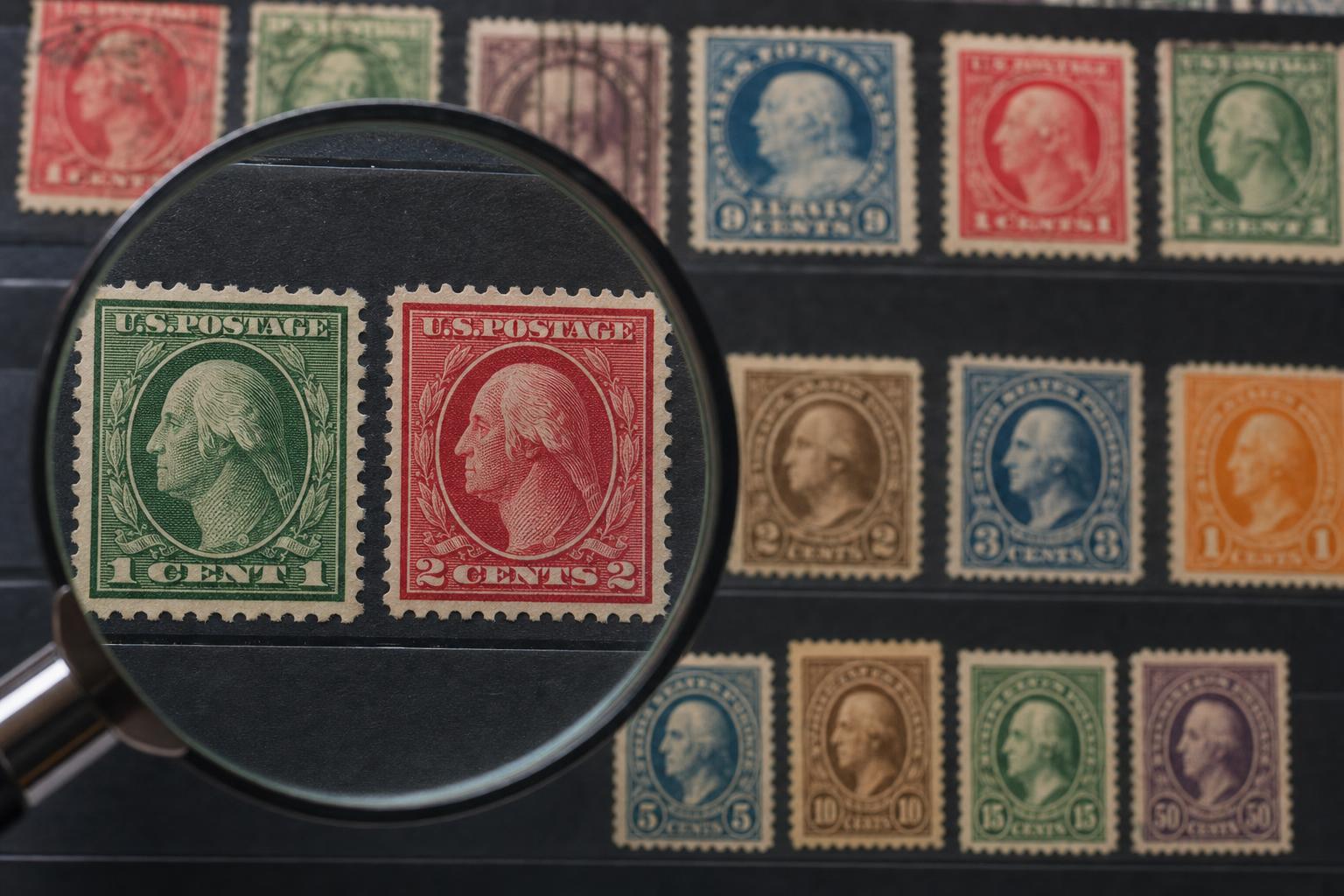
### What To Look For When You Examine A Stamp
If you want to really see a stamp, start with scale. Hold it far away, then bring it close. Look for contrasts, check the type, and notice any tactile treatments. Ask yourself what story the image tells at first glance and what it reveals on a second look. That simple ritual is how the decisions of stamp designers become legible.
A final note: next time you peel a stamp off an envelope, take a beat. You’re holding a tiny, deliberate piece of design that survived many decisions, edits, and proofs. It’s easy to miss the craft, but once you start looking, you’ll spot the signature moves of people who make mighty things out of small spaces—usps stamp designers at their best. And you might notice a small detail you hadn’t seen before, or a word spelled wrong on a preview sheet—recieve the discovery with a smile.
Leave a Reply